The first rule of dataviz.
Don’t say ‘dataviz.’
The visual display of data is an effective storytelling tool for mission-driven organizations–offering an immediate on-ramp into content, a deeper understanding of need, an affirmation of commitment and a charting of impact.
When talk turns to the visual display of data, ‘dataviz’ is often used as shorthand. ‘Dataviz’ can be all encompassing. The challenge with a catchall term like this is that it quickly leads to misalignment. Team members each have a clear picture of what ‘dataviz’ means, only each picture is different.
Here are four broad categories to better target your data display conversations.
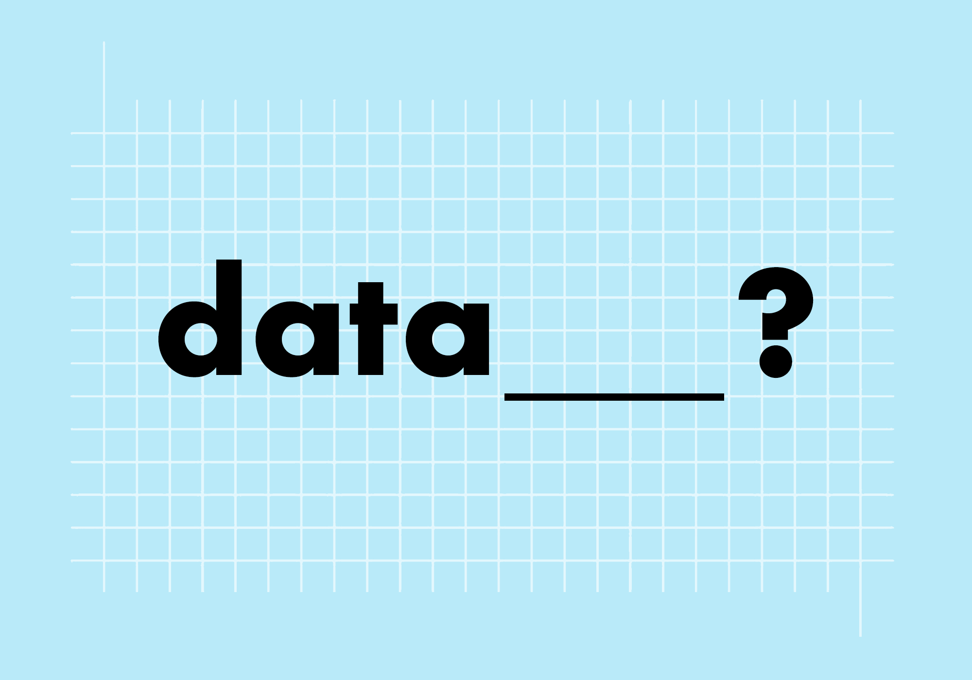
Datapoint – A discrete stat used to quickly establish scope, scale, or impact.
Think big numbers.Data comparison – A visual representation of proportional relationships.
Think charts and graphs.Data story – A data-forward narrative crafted to reinforce a specific point of view.
Think narrative.Database – A structured format for data that can be accessed and displayed.
Think deep dive.
The way data is discussed shapes how it’s ultimately presented. Be specific to avoid confusion from the start.