
A long-lasting logo for Laborers’ International Union of North America.
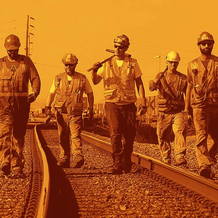
LIUNA’s members and prospective members continue to evolve. In 2007, a new visual identity was developed in conjunction with a website redesign to increase membership, activism, and political power for an increasingly Spanish-speaking constituency. The logo and supporting elements needed to reflect the brand promise of ‘A better life for you and your family’ and core brand attributes, including proud, strong, and unified.
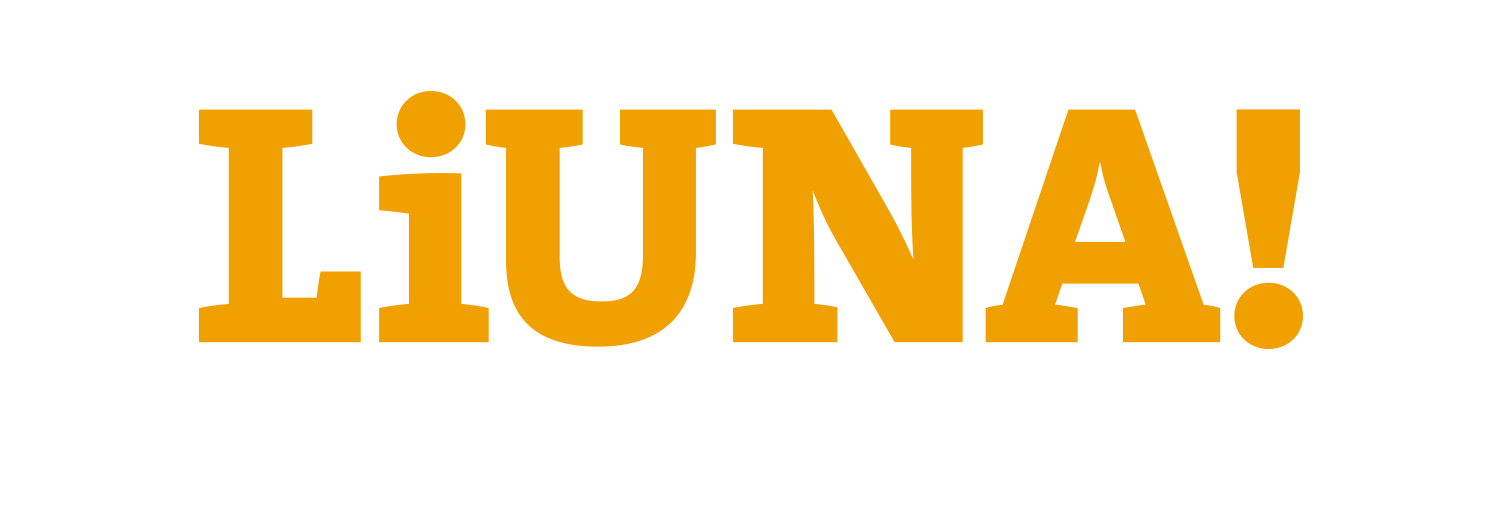
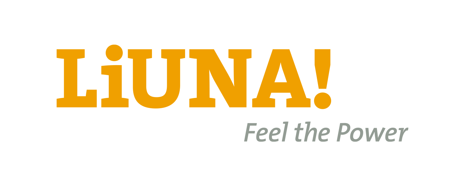
The LIUNA logo expresses the union as ‘LiUNA!.’ In this orthographical structure, the lowercase ‘i’ represents the ‘individual.’ The interplay of the ‘i‘ and exclamation point mimics a Spanish exclamation. ‘Feel the Power’ is a persistent tagline that reinforces the union’s collective strength. Safety orange and a bold slab serif font make the logo distinct and immediately recognizable.
Since its release, the logo has served as the fundamental brand element in all LIUNA communications. The logo reaches diverse audiences through a broad set of prominent applications–a massive banner takeover at their Washington, DC headquarters to raise awareness with policymakers, t-shirts and campaign graphics to motivate current members, NASCAR race and team sponsorships to drive new members, and NHL ice placements that remind us all to ‘Feel the Power!’
Role: Art Director | Agency: Threespot